Product labelling isn’t just about creating something pretty.
It’s about creating something that stands out on the shelf, oozes your brand values, and attracts attention. It should also lead the consumer down the path of purchasing your product.
If that sounds complicated, it’s because it is.
So, the question is: what should you do if you don’t have the budget available to hire a professional label designer?
We put this question to our talented in-house design team who have years of graphic design experience.
Here are the 13 best practices they shared with us:
#1: ALWAYS Design Your Labels in Adobe Illustrator (NOT Microsoft Word or Photoshop)
It may be tempting to use Microsoft Word or Adobe Photoshop to design your label, but they are poor choices for this type of task.
Here’s why:
Microsoft Word presents artwork in a way that is not suitable for printing high-quality labels.
It automatically converts images to RGB—a colour mode not supported by most commercial label presses (including ours)—meaning that any labels designed in Word will need to be reworked before printing.
This adds additional costs to the process and, honestly, should be avoided.
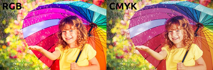
But, even if you don’t mind the additional costs, it worth noting that designs created in RGB don’t usually convert well to CMYK—the colours will often look dull and washed-out (see below).
Source - https://www.fastlabels.co.uk/blog/13-best-practises-for-label-design.html
It’s, therefore, a much better option to create your design in CMYK (so not in Microsoft Word).
Photoshop is certainly a slightly better choice, at least compared to Microsoft Word, but it still has drawbacks.
It’s nowhere near as good as Illustrator when working with vectors—in fact, you can’t export vectors from Photoshop—and in general, you’ll find that the quality of text and imagery in Photoshop is inferior to Illustrator.
Some have even reported pixelation issues when resizing images.
This is why you should always use Adobe Illustrator when designing labels.
Adobe Illustrator allows you to create (and work with) high-quality vector imagery that won’t pixelate when resized. This will ensure that your labels will turn out crystal clear when printed.
NOTE: Download a 7-day free trial of Adobe Illustrator here.
#2: Measure Your Container To Ascertain The Correct Label Size
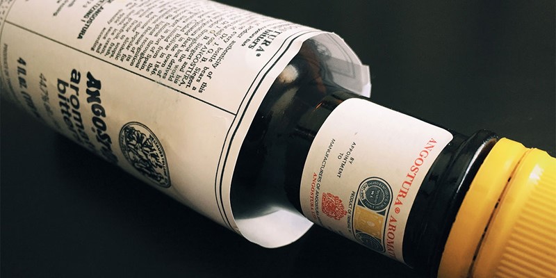
No matter what kind of container/packaging you’re applying your labels to, it’s paramount that you figure out the correct label size for your custom labels before you start the design process.
Failure to do this will result in improperly fitting labels that look embarrassingly incorrect when applied to the intended container or packaging (see below).
Source - https://vinepair.com/wine-blog/everything-you-ever-wanted-to-know-about-angostura-bitters/
Even if you have some flexibility when it comes to the size of your label (i.e. you don’t intend for the label to cover the entirety of the product packaging), there are two other very important reasons to get your label sizing right, which are:
- Costs: In general, bigger labels are slightly more expensive than smaller labels. It, therefore, makes zero sense make your labels any bigger than they need to be.
- Space: Many products (e.g. food/drink produce) have specific legal requirements when it comes to labelling, so there are a handful of things that your labels must contain. In this instance, you need to ensure that you start with a blank canvas large enough to behold said information.
We recommend that you measure your container and figure out the correct label size before you start designing your labels.
Here’s a fantastic 'how to' video on Youtube showing you how to do this. Or, if you prefer to read, check out this guide instead
#3: ALWAYS Design In CMYK (Not RGB)
Most commercial print presses print labels using a four-colour process known as CMYK—that’s cyan, magenta, yellow, and black (yeah, “K” stands for black...it’s a little confusing, we know!)
These four colours are combined in different ways to create various different colours.
But, most design applications—such as Adobe Photoshop—are set to the RGB colour mode by default. This is because these applications are primarily to create designs intended for consumption on electronic screens, which display things using RGB.
NOTE: RGB is a three-colour process (red, green, blue).
You, therefore, need to ensure that Adobe Illustrator is set up using CMYK mode (not RGB) before you start designing your labels.
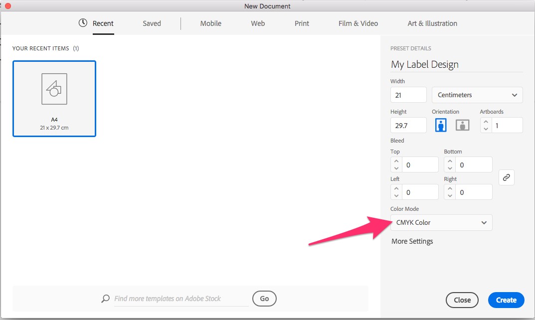
Here’s how to do it:
- Open any new document in Illustrator; it should default to CMYK mode (note: do not switch from RGB to CMYK. If you are forced to work in an RGB document and you want to print it, copy and paste it to a CMYK document and then adjust the colours, rather than adjusting the colour mode which will distort the colours).
- If Overprint Preview is not on in the view menu, turn it on.
- Make sure your Document Raster Effects is at 300PPI.
- Make sure any raster images in the document are 300PPI and CMYK format.
- Any blacks you have used should be accurate. You can adjust your preferences in Illustrator to display and output blacks accurately.
- Any project that uses an artboard should have a proper bleed (you can read about what this is in the next tip).
- Use Flattener Preview so you can check that the artwork flattens out in the way you want it to.
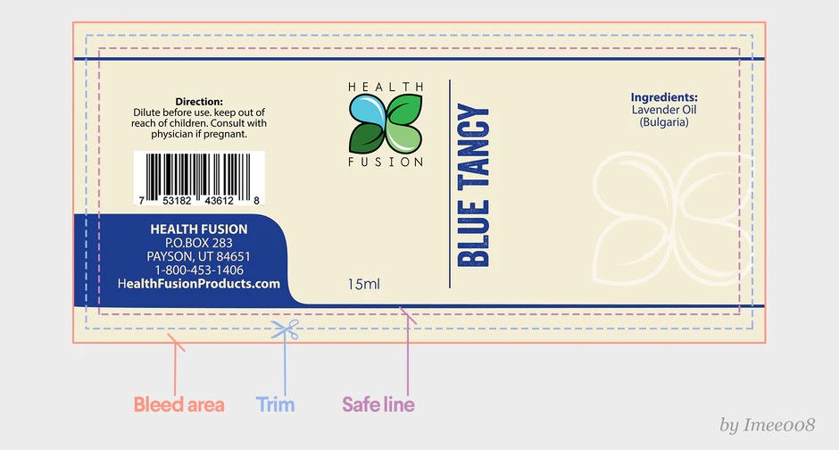
#4: Add a “Bleed Area” of 1/16th Inch
“Bleed” occurs when your label artwork “bleeds” slightly beyond the intended dimensions of the finished label.
This is done to ensure that there are no visible white borders when the printing process is complete and the label is die-cut along the “trim” line.
Source - https://99designs.co.uk/designer-resource-center/designing-product-label
You should always add a bleed area when designing labels for printing.
Setting the bleed up is very simple and won't take up much of your time. Simply ensure the graphics you have used extend beyond the intended label size by 1/16th of an inch.
NOTE: You might want to set up a background template as a guide.
Here’s a simple tutorial showing youhow to set up a bleed in Illustrator, on Youtube.
#5: STOP The Guesswork; Use Guides/Rulers To Line Up Your Artwork
There is no room for guesswork in custom label design.
The process of designing is time consuming and expensive, so the more you can avoid basic mistakes, the better.
Adobe Illustrator has a plethora of tools you can take advantage of to ensure your artwork is correctly aligned. You can use rulers, grids, guides, and “smart” guides to perfectly align artwork and ensure even distance between objects. There's really no excuse for guessing and making basic mistakes.
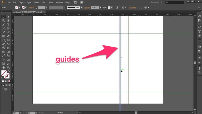
Here’s how to access these features in Adobe Illustrator:
- Rulers: View > Rulers > Show rulers (CMD/CTRL + R)
- Guides: View > Guides > Show guides (CMD/CTRL + ;)
- Smart Guides: View > Smart Guides (CMD/CTRL + U)
- Grid: View > Show Grid (CMD/CTRL + ‘)
Need more guidance? Checkout this complete guide to rulers, grids and guides on Illustrator by Adobe.
#6: Think About The Big Picture
Your label on its own could be a beautiful work of art—a masterpiece of a label that draws gasps of admiration from all who view it.
But, when placed on a supermarket shelf, it could look out of place, too loud, fade into the background, or look too similar to competitors.
If you do not think about the final placement of your product when you design it, you could be setting yourself up for an expensive fall. Just think about the potential for brand damage, loss in sales, ruining a trial with a big supermarket…it just doesn't bare thinking about.
That’s why you should always think about the big picture when designing your custom label. Your label design needs to be as effective on the shelf as it is on its own.
Thinking about the entire journey of the label also means you can be mindful of not hiding the artwork behind the price label, or avoiding concealing key information if the product is kept in a refrigerator.
NOTE: This amazing Ted Talk by Tony Fadell is a great place to start when you begin considering the visual effectiveness of your custom label.
#7: Aesthetics Aren’t Everything; Consider Functionality, Too
It’s easy to get tunnel vision when trying to design the perfect custom label, meaning it’s easy to end up focusing only on the visual appeal of your artwork.
But, remember: you have to consider the functionality of your label, as well as the visual appeal.
In almost all cases, the primary function of your product label will be to attract attention, stand out from the crowd, and invoke an initial curiosity inside the mind of the consumer. However, there are other things you may want to achieve with your product label.
Here are a couple of examples:
- You want your product to stand out on the shelf alongside an extremely unattractive competing product: Unattractiveness can often attract attention, even if it’s negative. If your competitor has an offensive/ugly label, you may way to expand the size of your label to ensure that it’s the most eye-catching label on the shelf.
- You want a label to provide additional details about the product, but you want the product itself to be front and center: This is often the case with food products, where you really want to showcase the way the food looks while the label itself takes a back seat. In this case, a small—or perhaps transparent/translucent—label is often the way to go.
Remember, labels can be opaque or transparent. They can fully cover the product, or they can be small and cover only a small amount of product. They can be made to draw the eye to the ingredients, or to a key piece of information that really sells the product.
So, always think carefully about exactly what you want your label to achieve—aside from being visually appealing—before getting stuck into the design process.
Product labels are not just there to make the product look nice, they are there to serve a purpose.
#8: Use High-Quality Images
Image quality is very important when you’re designing a label.
Source - https://i.pinimg.com/originals/48/79/f2/4879f229b5439319878fad709eec825a.jpg
In fact, this is a key area where labels can go from high-quality to low-quality really quickly.
For example, the logo might be great, the colour scheme striking, the tagline persuasive, but if the images are low-quality, the product gets downgraded by the customer in seconds. Thus, the quality of your images will have a detrimental effect on the effectiveness of your label.
So which images are best?
As a general rule, you should not use any images sourced from the internet. No JPEGs, because they don't print well. No GIFS, because you can’t print an animated image! And no PNGs (or other image formats) that are low-resolution.
Instead opt for a minimum of 300DPI (dots per image) and use vector images where possible.
#9: Make Sure The Logo/Branding Is Prominent
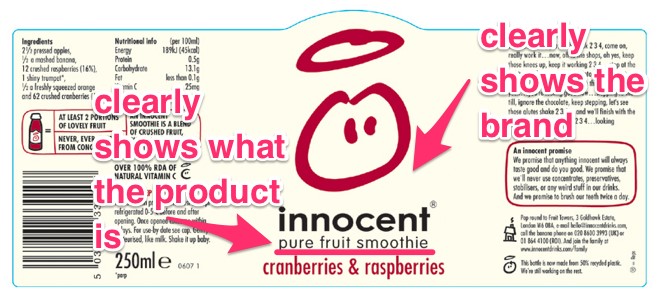
One of the key marketing priorities with custom label design is to let customers know who you are and what your product is.
Innocent do a great job of this; they display their logo prominently, thus creating a strong sense of brand identity. They also clearly communicate what the product is.
Source - http://blog.mmenterprises.co.uk/2007/03/innocent-drinks-label.htm
But, if your label design relies heavily on illustration/imagery/artwork, your logo can easily end up getting forgotten about.
Here are a few tips to ensure that your logo is front and center:
- Don’t use gradients/effects: The logo itself should not have any gradients or effects because that could have a negative effect on the printing process, particularly if you don't have much room on the label itself.
- Stick to “nice”, clear fonts: Ugly fonts and tons of information detract focus away from your brand/logo.
- Keep it simple: Don’t overload your label design; keep it simple and ensure that your logo is prominent in the design itself.
Remember, whatever your logo does look like, the beauty of custom label design is that you can personalise your label to showcase your brand. Over time, his will help to attract the attention of your target customers and, hopefully, persuade them to buy the product.
#10: Remember To Convert All Text To Outlines
Converting your text to outlines means that Adobe Ilustrator will no longer recognise the text as a font, ensuring there are no print errors like missing fonts or font substitutions.
Believe it or not, this is a common error that can occur when the art department of your custom label printing company receives your design and loads it up on their system.
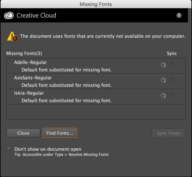
Source - https://helpx.adobe.com/illustrator/using/find-missing-fonts.html
It happens because they may not have the same fonts on their system as you do on yours, which results in an automatic font substitution.
Luckily, it can be avoided with this simple conversion.
To convert your text to outlines, first make sure you spell check all your wording, maybe even getting another person to check it as well before signing anything off. Then follow this handy guide to converting text to outlines in Adobe Illustrator.
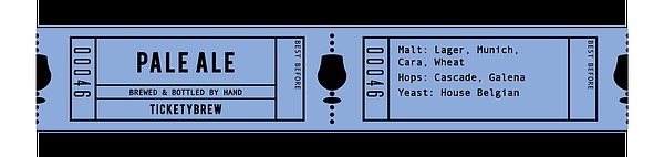
#11: Don’t Overcrowd Your Design; Keep It Simple
Eye tracking studies tell us a lot about what our eyes do when we're buying.
For example, eye tracking tells us about issues such as dead weight, where the eye is drawn to information that won't lead to sales.
Source - https://www.ticketybrew.co.uk/core-beers
To avoid this issue when designing your label, it is really important to avoid overcrowding your design with too many images and too much text—Ticketybrew do a great job of this with their beer labels.A busy label can lead to confusion, annoyance and eventual dismissal of your product as a potential purchase.
So, while the product and brand name should be key priorities—along with taglines and any information that persuades the customer to purchase—keep the rest of your text and graphics as minimal as possible.
This is really important if you want an effective custom label design.
#12: Don’t Forget About Labelling Regulations
A beautiful and effective label is worthless if it is illegal.
Labelling regulations mean certain information you place on your labels is not there by choice, but necessity.
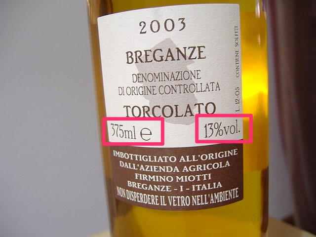
Source - https://commons.wikimedia.org/wiki/File:Torcolato_Breganze_DOC,_Firmino_Miotti.jpg
For example, the food and drink labelling laws in the UK are detailed and should be one of the first things you get up to speed on when designing a custom label. The UK food labelling and packaging laws state that your label must be:
- Easy to read
- Clear
- Permanent
- Easy to understand
- Easy to see
- Not misleading in any way
There is also certain information you must clearly display, such as the ingredients contained within and allergen warnings.
NOTE: There are additional regulations for wine labelling, nutritional labelling, health claims, supplement labelling, organic food labelling and also plastic, ceramic and cellophane packaging. You can read about all of the UK food and drink labelling laws here.
Bottomline: always make sure you’re aware of local regulations because you start designing your labels.
#13: Designing a Label For Retail? Remember To Add a Barcode!
Labels for retail should include a UPC barcode. These are usually printed in one dark colour to make them as effective as possible.
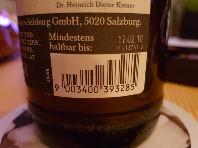
Source - https://upload.wikimedia.org/wikipedia/commons/thumb/a/a5/Stiegl_Radler_Barcode.jpg/4032px-Stiegl_Radler_Barcode.jpg
This is necessary because barcodes are used as a supply chain element to ensure a product can be tracked along each stage of sale. They also provide information about the product at various stages of sale.
Barcodes that are cropped or not printed properly are ineffective, so make sure you follow these guidelines when designing your label.
A Custom Approach To A Custom Label
That’s it—that’s the basics of creating a beautiful, effective label design the right way.
It doesn’t matter whether you plan to enjoy the benefits of having a professional designer create your label, or strive to design your label yourself, these tips should help you create something functional, effective, and beautiful.
Need a designer? Get in touch about our custom label design services.
If you are still unsure about anything or need some professional advice, please do get in touch and our friendly design team will be more than happy to help.